Usage
Usage
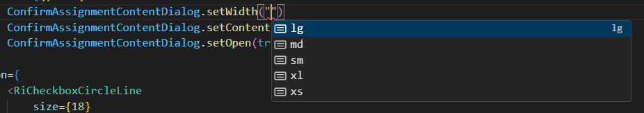
ConfirmAssignmentContentDialog.setWidth("sm"); ConfirmAssignmentContentDialog.setContent(() => () => ( <ConfirmAssignmentContent /> )); ConfirmAssignmentContentDialog.setOpen(true);
In fact we have the following options:
Definition of GeneralDialog
Definition of GeneralDialog
import { Breakpoint, Dialog } from "@mui/material"; import { OverlayScrollbarsComponent, OverlayScrollbarsComponentRef } from "overlayscrollbars-react"; import { useRef, useState } from "react"; export default class GeneralDialog { public setContent = (_: () => () => JSX.Element) => { }; public setOpen: (open: boolean) => void = () => { }; public setBackgroundColor: (bgColor: string) => void = () => { }; public setWidth: (width: false | Breakpoint | undefined) => void = () => { }; public open: () => void = () => { }; public close: () => void = () => { }; render = () => { const [content, setContent] = useState(() => () => <></>) const [open, setOpen] = useState(false); const [bgColor, setBgcolor] = useState("white"); const [width, setWidth] = useState<false | Breakpoint | undefined>("md") const ref = useRef<OverlayScrollbarsComponentRef<"div"> | null>(null); this.setOpen = setOpen; this.setContent = setContent; this.setWidth = setWidth; this.open = () => setOpen(true); this.close = () => setOpen(false); this.setBackgroundColor = setBgcolor const Content = content; return ( <Dialog PaperProps={{ style: { backgroundColor: bgColor, zIndex: 10 ** 7 + 1 } }} maxWidth={width} fullWidth={true} onClose={() => { setOpen(false) }} open={open} > <OverlayScrollbarsComponent style={{ height: "100%", width: "100%", overflowY: "auto" }} ref={ref} options={{ scrollbars: { autoHide: "leave", autoHideDelay: 100, } }} > <Content /> </OverlayScrollbarsComponent> </Dialog > ); } }