


1. Usage Example
1. Usage Example
... <div style={{ display: 'flex', justifyContent: 'flex-end' }}> <CustomModalTrigger modalContent={AddUserModal}> <Button type="primary">Add Staff</Button> </CustomModalTrigger> </div> ...
And the resulting modal:
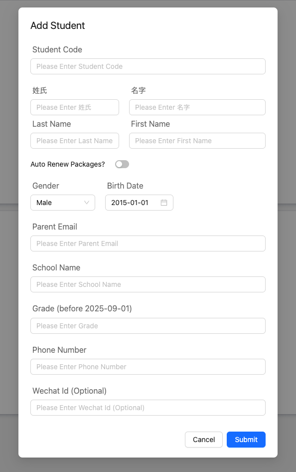
2. The Concret AddUserModal Example
2. The Concret
AddUserModal ExampleWe will be defining CustomModalProps in the next section, for reference we copy that definition here:
type CustomModalProps = { setOnOk: (action: Action) => void; setOkText: (text: string) => void; };
1export default function AddUserModal(props: CustomModalProps) { 2 const { setOnOk: setOnOk, setOkText } = props; 3 const dispatch = useAppDispatch(); 4 const formData = useRef<Partial<CreateUserRequest>>({ 5 role_in_system: 'STAFF', 6 }); 7 const [error, setError] = useState<Partial<CreateUserRequest>>({}); 8 const update = (update_: Partial<CreateUserRequest>) => { 9 formData.current = { ...formData.current, ...update_ }; 10 }; 11 const handleChange = (value: string) => { 12 update({ role_in_system: value as RoleInSystem }); 13 }; 14 15 const roleSelections: { value: RoleInSystem; label: string }[] = [ 16 { value: 'STAFF', label: 'Staff' }, 17 { value: 'ADMIN', label: 'Admin' }, 18 { value: 'SUPER_ADMIN', label: 'Super Admin' }, 19 ]; 20 21 const submit = async () => { 22 const res = await apiClient.post<CustomResponse<undefined>>(apiRoutes.POST_CREATE_USER, formData.current); 23 if (!res.data.success) { 24 const errorMessage = res.data?.errorMessage; 25 const errorObject = res.data?.errorObject; 26 if (errorMessage) { 27 toastUtil.error(errorMessage); 28 } 29 if (errorObject) { 30 setError(errorObject); 31 } 32 } else { 33 toastUtil.success('User Created'); 34 AddUserDialog.setOpen(false); 35 dispatch(UserThunkAction.getUsers()); 36 } 37 }; 38 setOnOk(submit); 39 setOkText('Submit');
Note that we set the ok-action and ok-text here. Which under the hood update the value created by useRef in the modal created by our custom trigger. We would not do useState because that will definitely cause recurrsive rendering loop.
40 return ( 41 <Box 42 style={{ 43 maxWidth: 400, 44 width: 600, 45 padding: '40px 80px', 46 overflowY: 'auto', 47 paddingBottom: 60, 48 }} 49 > 50 <SectionTitle>Add Staff</SectionTitle> 51 <Spacer /> 52 <FormInputField 53 title="English First Name" 54 onChange={t => update({ first_name: t })} 55 error={error?.['first_name']} 56 /> 57 <FormInputField 58 title="English Last Name" 59 onChange={t => update({ last_name: t })} 60 error={error?.['last_name']} 61 /> 62 <FormInputField 63 title="Chinese First Name" 64 onChange={t => update({ chinese_first_name: t })} 65 error={error?.['chinese_first_name']} 66 /> 67 <FormInputField 68 title="Chinese Last Name" 69 onChange={t => update({ chinese_last_name: t })} 70 error={error?.['chinese_last_name']} 71 /> 72 <FormInputField 73 title="Company Email" 74 onChange={t => update({ company_email: t })} 75 error={error?.['company_email']} 76 /> 77 <FormInputField title="Password" onChange={t => update({ password: t })} error={error?.['password']} /> 78 <FormInputField 79 title="Phone Number" 80 onChange={t => update({ mobile_number: t })} 81 error={error?.['mobile_number']} 82 /> 83 <FormInputField 84 title="Role In Company" 85 onChange={t => update({ role_in_company: t })} 86 error={error?.['role_in_company']} 87 /> 88 <FormInputTitle>Role in System</FormInputTitle> 89 <Spacer height={5} /> 90 <Select 91 dropdownStyle={{ zIndex: 10 ** 4 }} 92 defaultValue="STAFF" 93 style={{ width: 130 }} 94 onChange={handleChange} 95 options={roleSelections} 96 /> 97 <Spacer /> 98 <Spacer /> 99 </Box> 100 ); 101}
3. Modal with more Custom Props
3. Modal with more Custom Props
As in the AddUserModal we slightly change the siguature:
export default function AddUserModal(props: CustsomModalProps & { someValue: string }) {
now we inject our props by
<CustsomModalTrigger modalContent={(props) => <AddUserModal {...props} someValue="Hello" />} > <Button type="primary">Add Staff</Button> </CustsomModalTrigger>
This is very helpful if our modal needs to be dynamic to some state of the current page.
4. Code Implementation of CustomModalTrigger
4. Code Implementation of CustomModalTrigger
import { Button, Modal } from "antd"; import { BaseButtonProps } from "antd/es/button/button"; import { ReactNode, useRef, useState } from "react"; export type CustsomModalProps = { setOnOk: (action: Action) => void; setOkText: (text: string) => void; }; type Action = () => void | Promise<void>; const CustomModalTrigger = (props: { style?: CSSProperties; modalClassName?: string; okButtonType?: BaseButtonProps["type"]; modalContent: (props: CustomModalProps) => ReactNode; children: ReactNode; }) => { const { okButtonType = "primary", style } = props; const [loading, setLoading] = useState(false); const [open, setOpen] = useState(false); const modalRef = useRef<{ okText: string; onOk: Action; }>({ okText: "Ok", onOk: () => {}, }); const setOkText = (text: string) => { modalRef.current.okText = text; }; const setOnOk = (action: Action) => { modalRef.current.onOk = action; }; return ( <> <div style={{ display: "inline-block", ...style }} onClick={() => setOpen(true)} > {props.children} </div> <Modal destroyOnClose={true} styles={{ content: { maxHeight: "80vh", maxWidth: "60vw", overflowY: "scroll", }, }} open={open} className={props.modalClassName} centered closable={false} onCancel={() => { setOpen(false); }} onClose={() => { setOpen(false); }} okText={modalRef.current.okText} footer={[ <Button key="back" onClick={() => setOpen(false)}> Cancel </Button>, <Button key="submit" type={okButtonType} loading={loading} onClick={async () => { try { setLoading(true); await modalRef.current.onOk(); console.log("closing it"); setOpen(false); } finally { setLoading(false); } }} > {modalRef.current.okText} </Button>, ]} > {props.modalContent({ setOkText, setOnOk, })} </Modal> </> ); }; export default CustsomModalTrigger;