


1. The Problem of BottomSheet in React-Native
BottomSheet in React-NativeWhen it comes to mobile very often we need a button to trigger a BottomSheet.
Defining a BottomSheet as well as the mechanism to triggeer that BottomSheet can be very cumbersome.
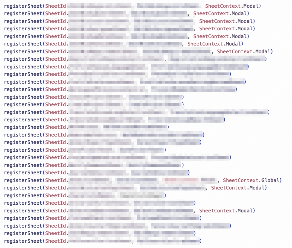
In a React-Native project of my current company we have used something called @expo/react-native-action-sheet, a BottomSheet via this (or other similarly library) involves the following definitions:
import ActionSheet, { registerSheet } from "react-native-actions-sheet"; function MyCustomSheet() { return ( <ActionSheet id="mySheetId"> {/* Your custom content here */} </ActionSheet> ); } registerSheet("mySheetId", MyCustomSheet);
And for better code organization we often separate files to define:
-
The custom
BottomSheetcontent (to be wrapped byActionSheet). -
A unified file to store those
mySheetId's as aEnum. -
A unified file to register all those components.
Sometimes we even need to pass existing states into these BottomSheet component, therefore we need to maintain another list of interfaces
-
export interface SheetPayload { "mySheetId": { payload: TExternalState } }so that in custom
MySheetContentyou can defineexport const MySheetContent = (props: SheetPayload["mySheetId"]) => { // or we directly code the content here return ( <ActionSheet> <SomeOtherComponent {...props}/> </ActionSheet> ) } -
When the project grows ..., 💥
2. The Solution
2.1. Motivation
In this article I have built a custom modal trigger with the help of Modal element from ant-design's modal. The trigger has the following interface:
<CustsomModalTrigger modalContent={(props) => <AddUserModal {...props} someValue="Hello" />} > <Button type="primary">Add Staff</Button> </CustsomModalTrigger>
We will be vibe-coding a counterpart for react-native in section 〈2.3. Code Implementation for CustomBottomSheetTrigger〉.
Let's first go through some examples on how to use it:
2.2. Usage of CustomBottomSheetTrigger
2.2.1. Minimal Example
The final interface we have:
<CustomBottomSheetTrigger renderComponent={(props) => <MyContent {...props} title="Hello" />} > {(openSheet) => <Button onPress={openSheet}>Open</Button>} </CustomBottomSheetTrigger>
where
const MyContent = ({ close, title }: BillieBottomSheetProps & { title: string }) => ( <View> <Text>{title}</Text> <Button onPress={close}>Close</Button> </View> )
2.2.2. Example which helps set values
Sometimes we want a bottom sheet to let users make selection, we want to set the state after the selection is done.
Now we simply pass a setter into the bottom sheet content:
<CustomBottomSheetTrigger renderComponent={(props) => { return ( <ValueOptionsList {...props} customField={customField} initialValueIds={selectedValueIds} setValueIds={updateValues} /> ) }} > {(openSheet) => ( <Pressable onPress={openSheet}> {display for selectedValueIds ...} </Pressable> )} <CustomeBottomSheetTrigger>
2.3. Code Implementation for CustomBottomSheetTrigger
This Trigger is a wrapper of BottomSheet from @gorhom/bottom-sheet:
import { BottomSheetBackdrop, BottomSheetBackdropProps, BottomSheetModal, BottomSheetView } from "@gorhom/bottom-sheet" import { cloneElement, ComponentType, isValidElement, ReactElement, ReactNode, useCallback, useMemo, useRef, useState, } from "react" import { TouchableOpacity, ViewStyle } from "react-native" export type BillieBottomSheetProps = { close: () => void } export const CustomBottomSheetTrigger = (props: { style?: ViewStyle renderComponent: ComponentType<BillieBottomSheetProps> children: ReactNode | ((openBottomSheet: () => void) => ReactNode) enableBackdropDismiss?: boolean }) => { const { style, renderComponent: RenderComponent, children, enableBackdropDismiss = true } = props const [open, setOpen] = useState(false) const modalRef = useRef<BottomSheetModal>(null) const closeOnly = useCallback(() => { modalRef.current?.dismiss() }, []) const handleOpen = useCallback(() => { setOpen(true) modalRef.current?.present() }, []) const handleDismiss = useCallback(() => { setOpen(false) }, []) const renderBackdrop = useCallback( (props: BottomSheetBackdropProps) => ( <BottomSheetBackdrop {...props} disappearsOnIndex={-1} appearsOnIndex={0} pressBehavior={enableBackdropDismiss ? "close" : "none"} /> ), [enableBackdropDismiss], ) // Handle both render prop and element children const trigger = useMemo(() => { // If children is a function, call it with openBottomSheet if (typeof children === "function") { return children(handleOpen) } // If children is a valid React element, clone and inject onPress if (isValidElement(children)) { return cloneElement(children as ReactElement<any>, { onPress: handleOpen, }) } // Fallback: wrap in TouchableOpacity return ( <TouchableOpacity style={style} onPress={handleOpen}> {children} </TouchableOpacity> ) }, [children, handleOpen, style]) return ( <> {trigger} <BottomSheetModal enableDynamicSizing={true} backgroundStyle={{ backgroundColor: "rgb(255,255,255)" }} containerStyle={{ backgroundColor: "transparent", borderRadius: 20 }} handleStyle={{ backgroundColor: "transparent" }} style={{ borderRadius: 20 }} enablePanDownToClose={true} backdropComponent={renderBackdrop} onDismiss={handleDismiss} ref={modalRef} > <BottomSheetView>{open && <RenderComponent close={closeOnly} />}</BottomSheetView> </BottomSheetModal> </> ) } export default CustomBottomSheetTrigger